Let’s talk?
[email protected]
BOLD, SEXY, UNFORGETTABLE:
Fitness Brand Identity
Client:
ImPulse by Zanda
Zariņa Rešetina
Services:
Visual Identity
Brand Assets
Pattern Design
Brand Applications
Brand Guidelines
Social Media Templates
Industry:
Fitness
Health
Wellness
In collaboration with:
planktones.studio
The Challenge
Zanda, a renowned fitness trainer and nutrition coach in Latvia, had developed a comprehensive training, nutrition and wellness program “ImPulse” for busy, educated women. The challenge was to create a powerful fitness branding – a visual identity that was not only friendly but also bold and sexy, reminiscent of the top sports clubs in LA and NY, while capturing the essence of movement, energy, and physical activity.
The Outcome
We crafted a cohesive visual identity that amplified brand recognition and consistency across all platforms. Our efforts helped Zanda successfully launch her program, significantly boosting brand awareness and recognition, and laying a strong foundation for ImPulse’s long-term growth and engagement.
HOLISTIC WELLNESS REVOLUTION
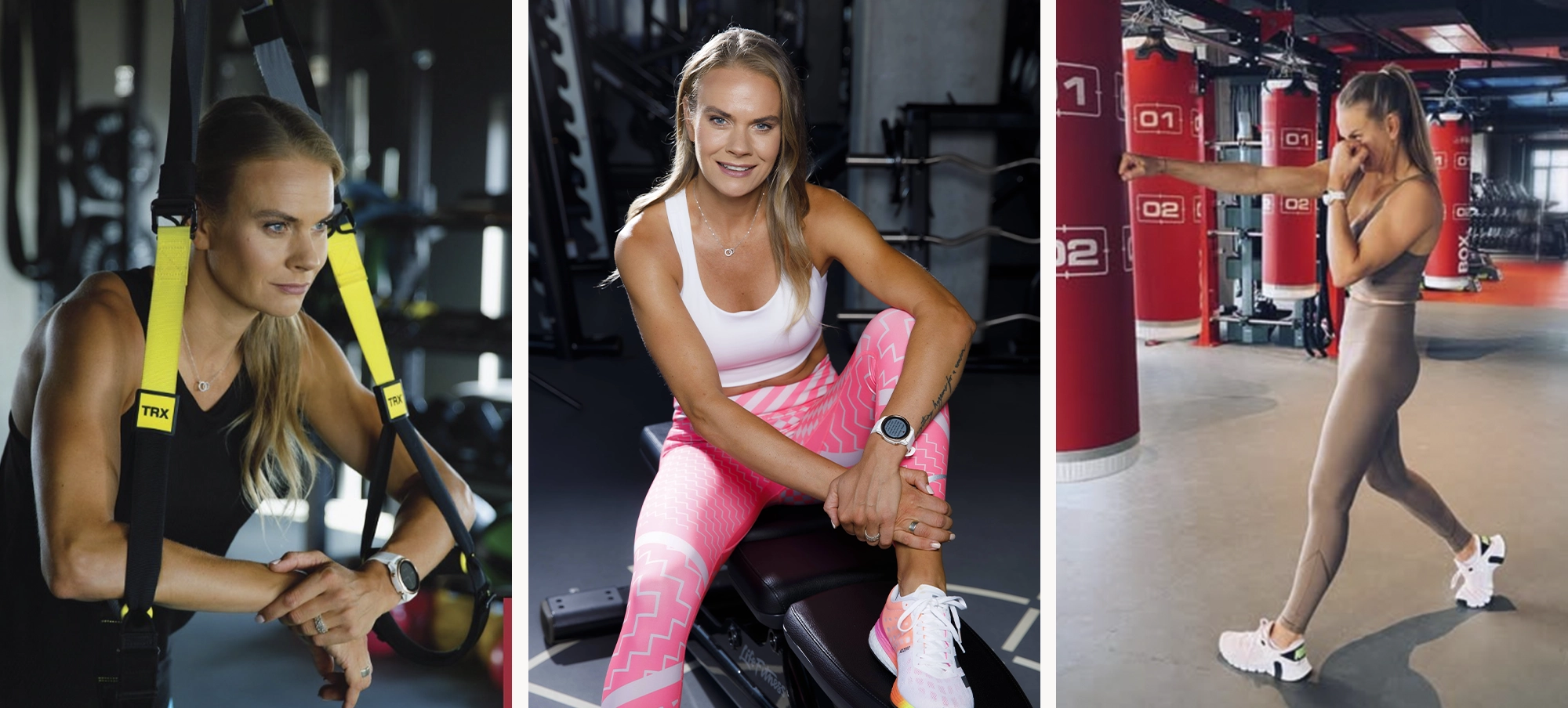
Meet Zanda, Latvia’s premier private fitness trainer and nutrition coach. Her mission is to revolutionize your lifestyle with a holistic and sustainable program that seamlessly blends physical activity, nutrition, and mental well-being. Unlike fleeting fitness fads, Zanda’s approach is all about lasting transformation. She arms you with the knowledge and tools to achieve lifelong wellness, empowering you to thrive. Zanda’s program is tailor-made for busy, sophisticated women who crave a healthier and more balanced life.
Her seamless integration of wellness into daily routines isn’t just about improving fitness – it’s about enhancing every aspect of life. In the ever-evolving world of fitness and wellness, standing out demands more than just expertise. Fitness branding requires a visual identity that resonates and inspires. Recognizing this, Zanda turned to us to craft a brand that mirrors her holistic vision, ensuring her philosophy isn’t just heard but seen and felt.
The Logo
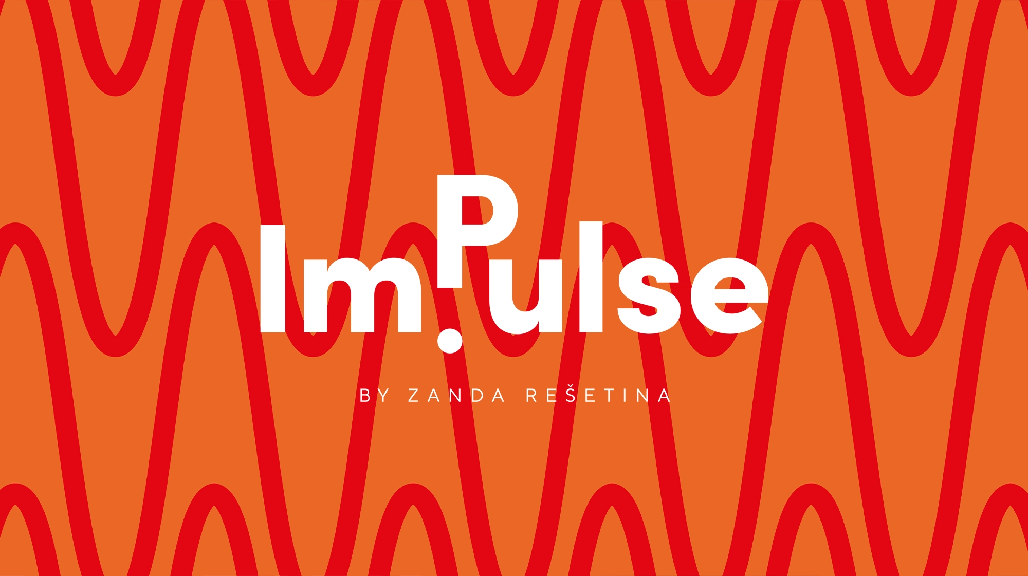
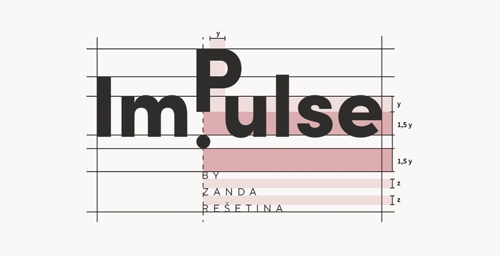
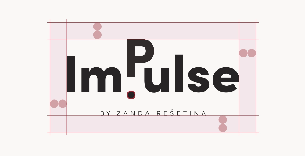
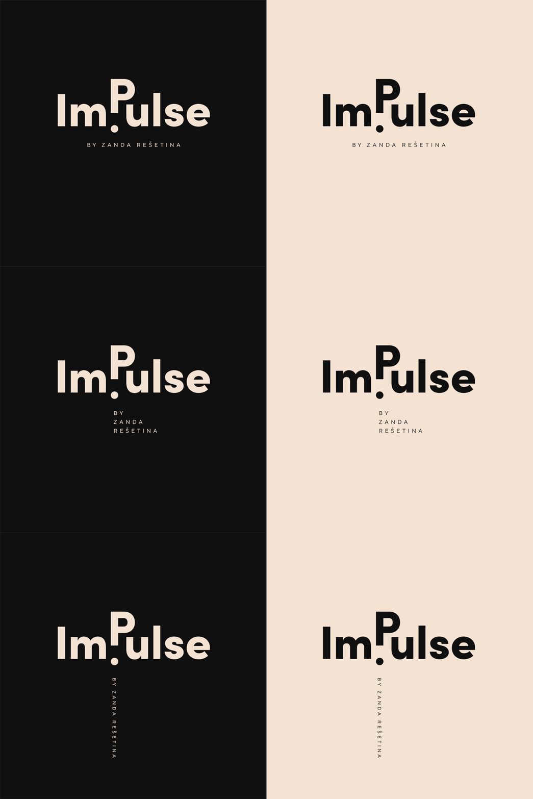
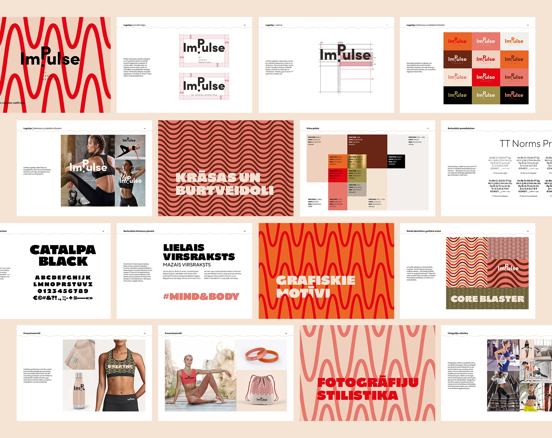
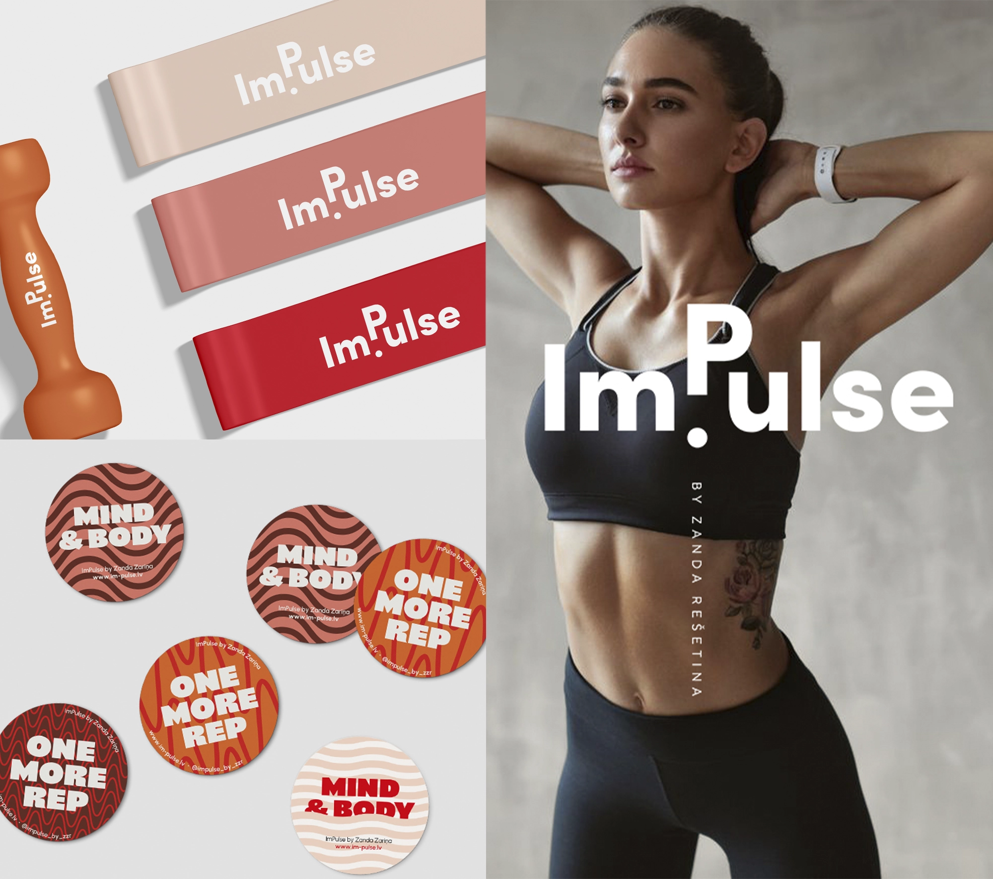
Logo is centered around a “ball” symbol, representing the “impulse” for motion and activity. This emblem powerfully conveys the brand’s promise – to ignite a lifelong passion for an active and holistic lifestyle. The tagline, designed to be both flexible and playful, further enhances the brand’s approachable nature.

Visual Concept / Pattern Design
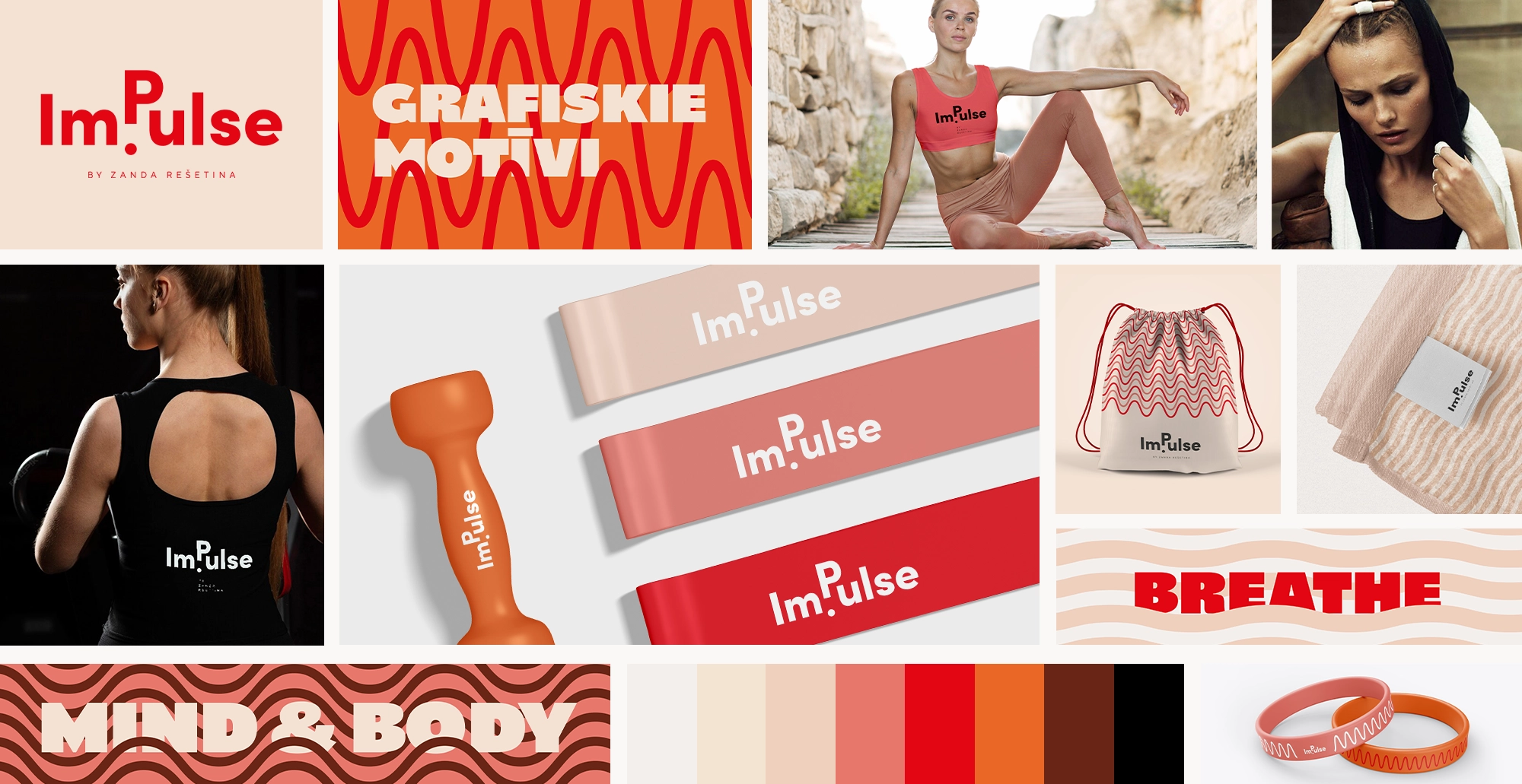
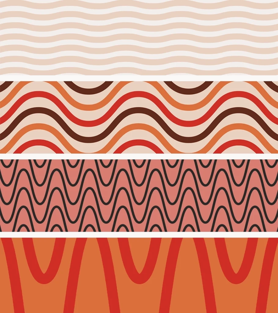
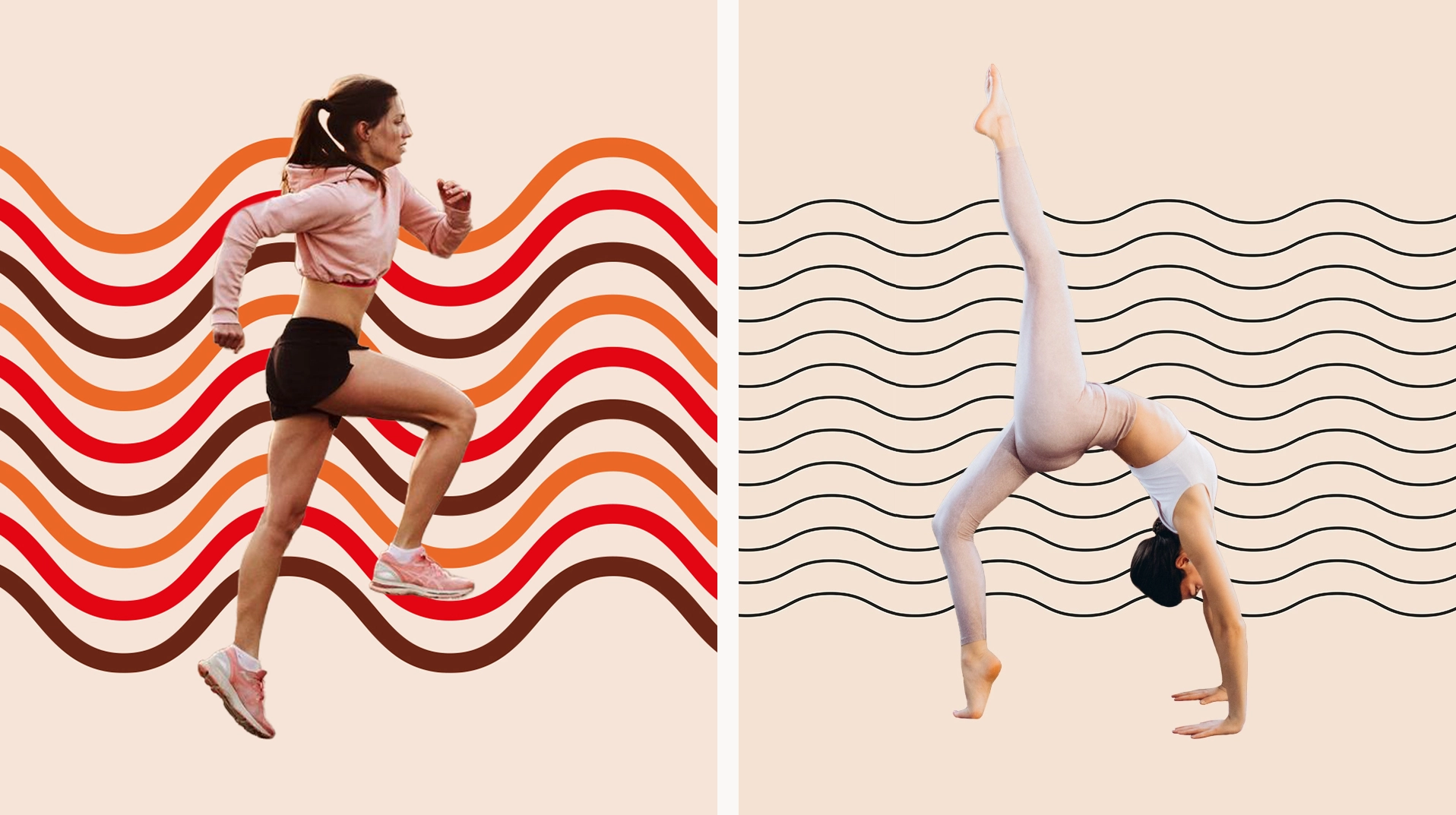
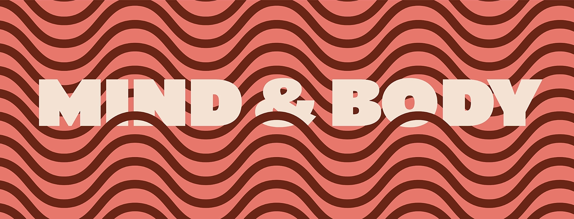
The brand’s graphic motifs, featuring dynamic lines, symbolize breath, exhalation, and pulse rates during various physical activities. These motifs ebb and flow in intensity, with soothing, low-contrast patterns for calming practices like yoga, and electrifying, high-contrast patterns for vigorous workouts. This dual approach ensures the visual identity encapsulates both serenity and vitality, perfectly reflecting the diverse activities within the program.
Fitness BRANDing & STYLE GUIDELINES
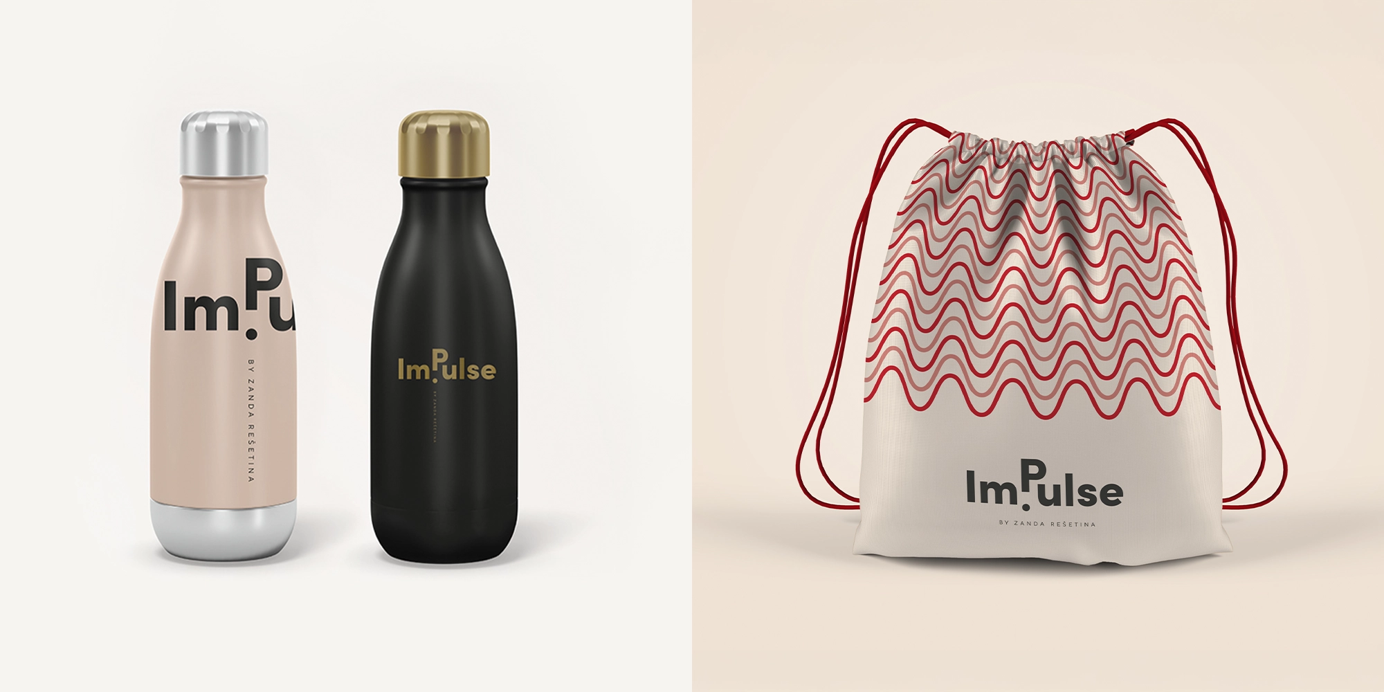
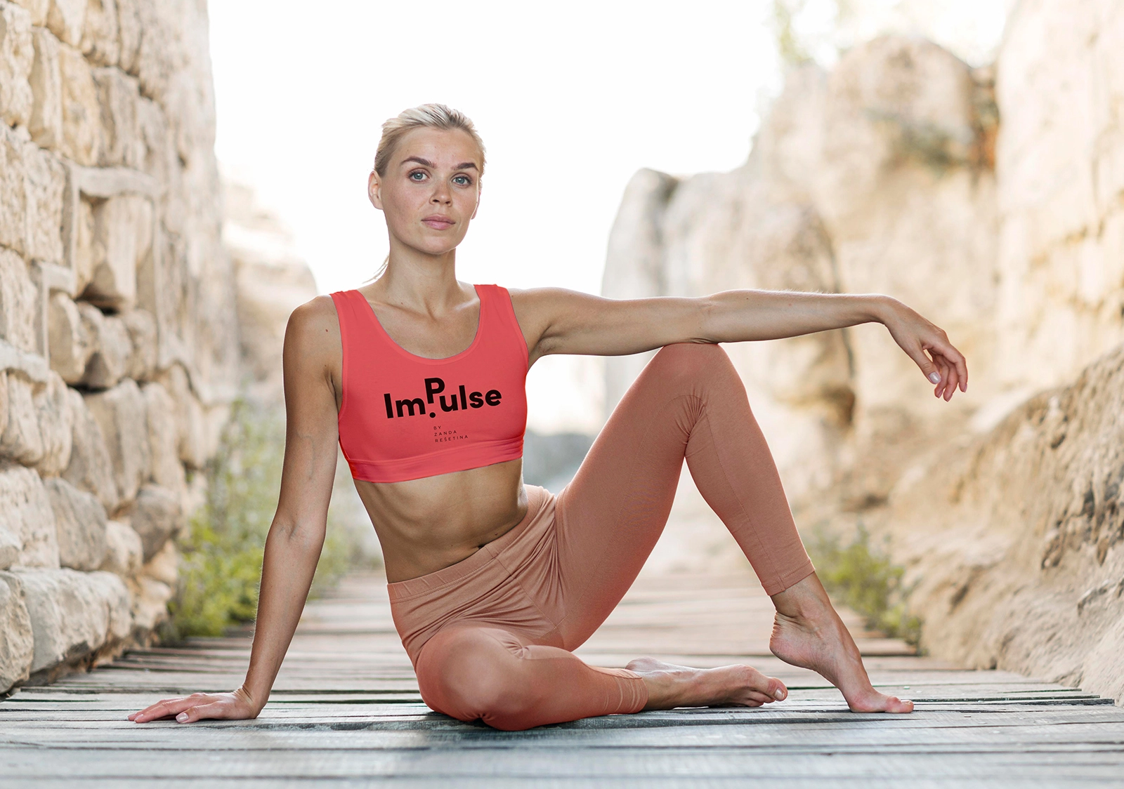
We crafted a comprehensive style guide to guarantee that every piece of marketing material, digital interface, and brand collateral perfectly embodies the brand’s identity. This approach to fitness branding fosters not only brand recognition but also trust among customers. With this clear and well-defined style guide, Zanda can now achieve a cohesive and unified look and feel, essential for building a strong, memorable, and impactful brand presence.
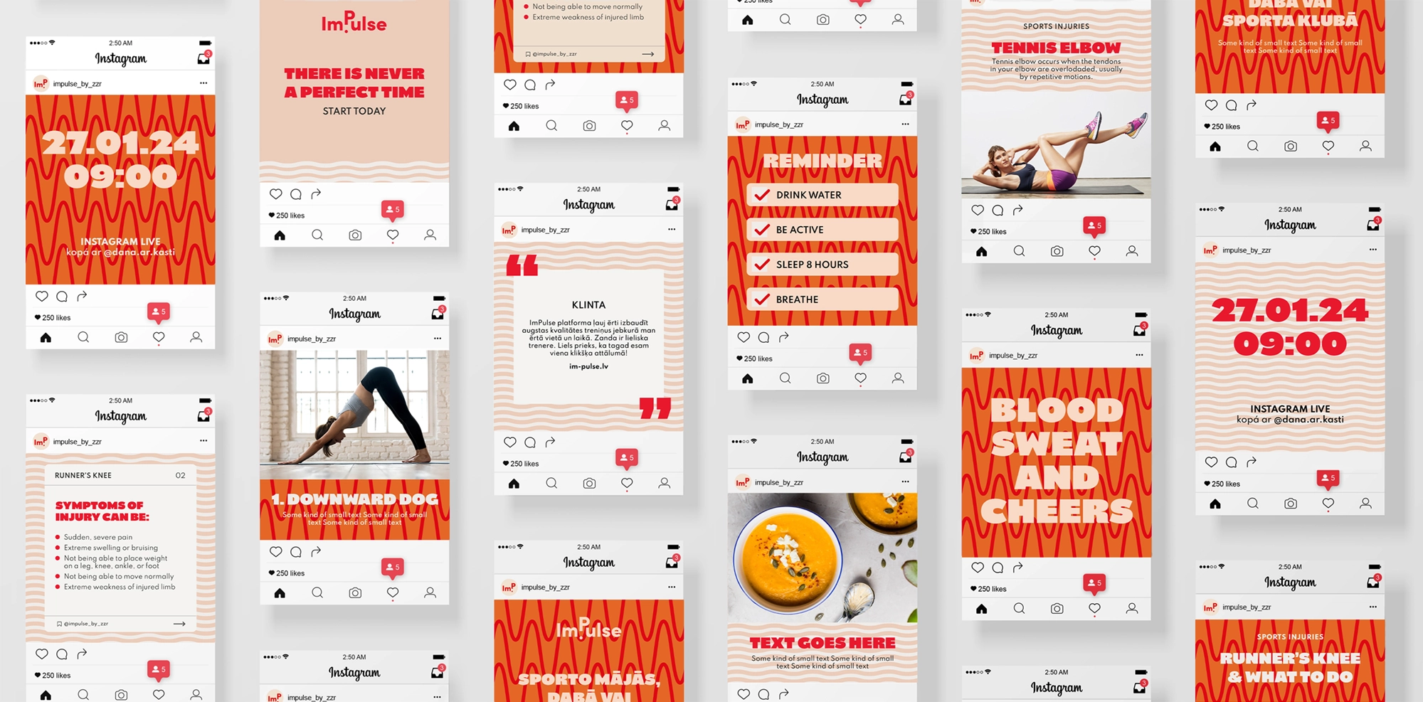
SOCIAL MEDIA TEMPLATES
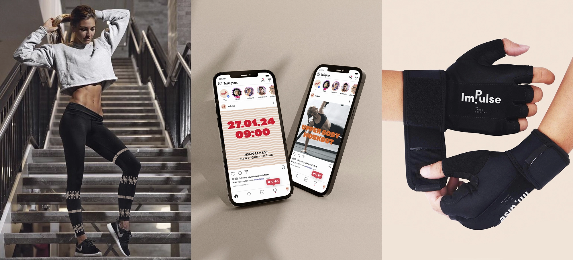
A year after our initial collaboration, Zanda reached out to extend her fitness brand’s visual identity to Instagram post templates. We ensured that every social media interaction remained consistently on-brand, thereby enhancing her online presence.
the impact
The visual identity we developed for ImPulse has significantly elevated the brand’s presence in the competitive fitness and wellness industry. Despite being a relatively new entrant in the market, ImPulse has achieved some notable milestones.
✦ Enhanced brand recognition and foundation for long-term success ✦ Social Media growth ✦ Increased website traffic ✦ Continued collaboration
