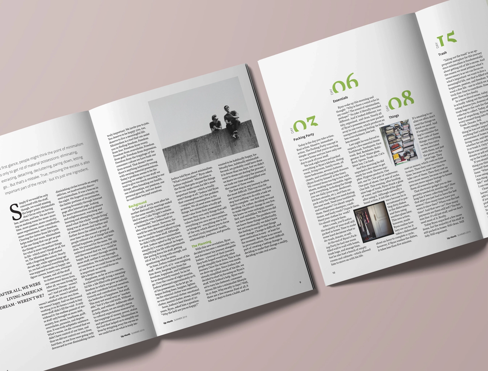
editorial JOURNEY TO MINDFULNESS:

CELEBRATING IMPERFECTION

three Editorial magazine cover designs with bold typography, creative layout, and editorial photography for print issues

University assignment,
BAU, Centre Universitari d’Arts i Disseny

Services:
Editorial Design
Art Direction
Print Design
Magazine Design
Layout Design

Industry:
Lifestyle

The Challenge

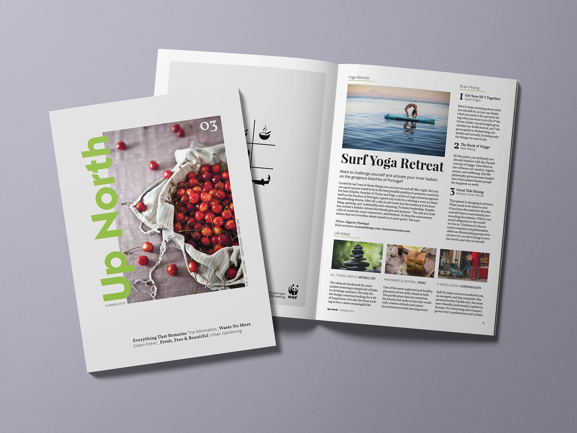
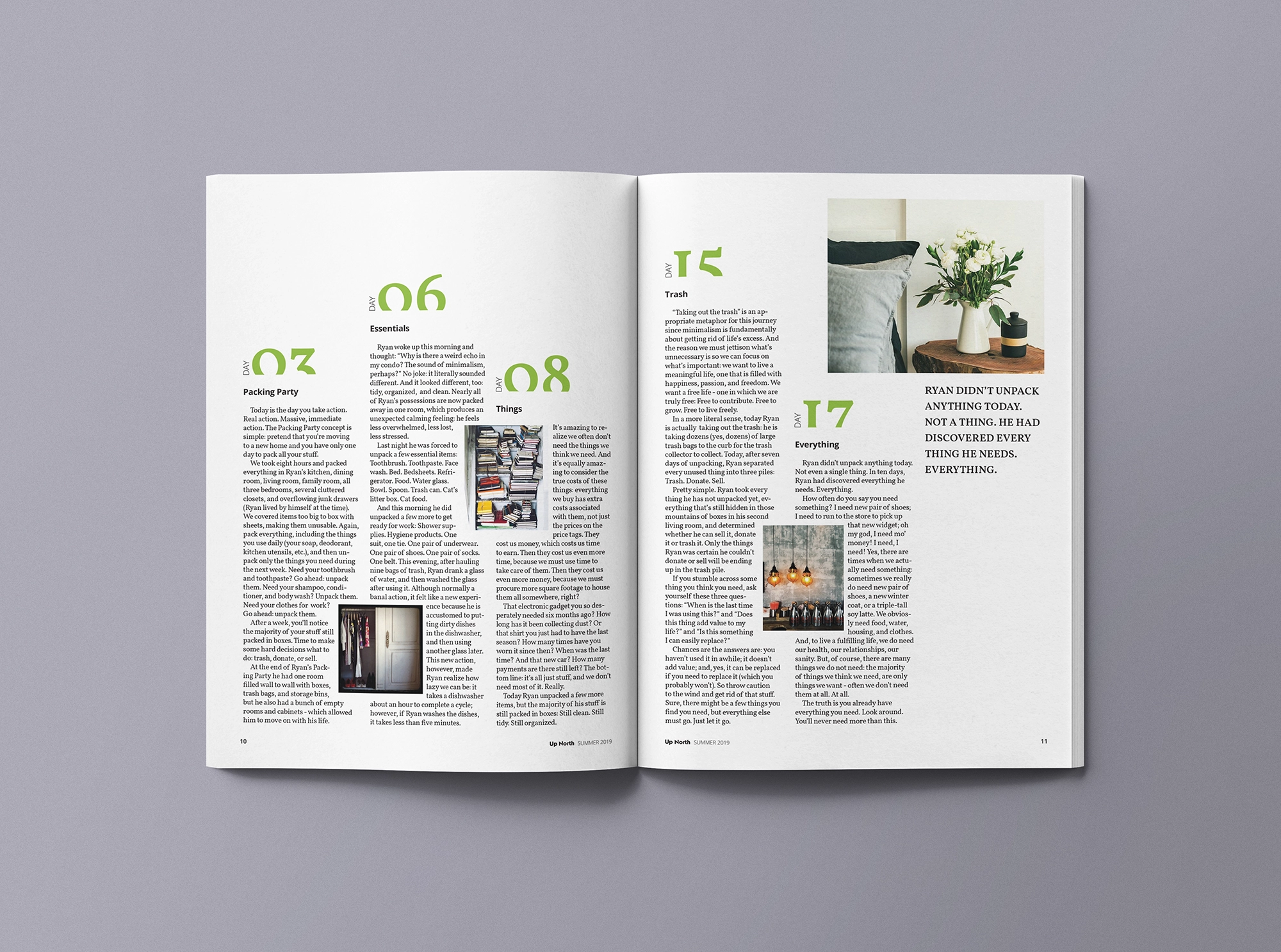
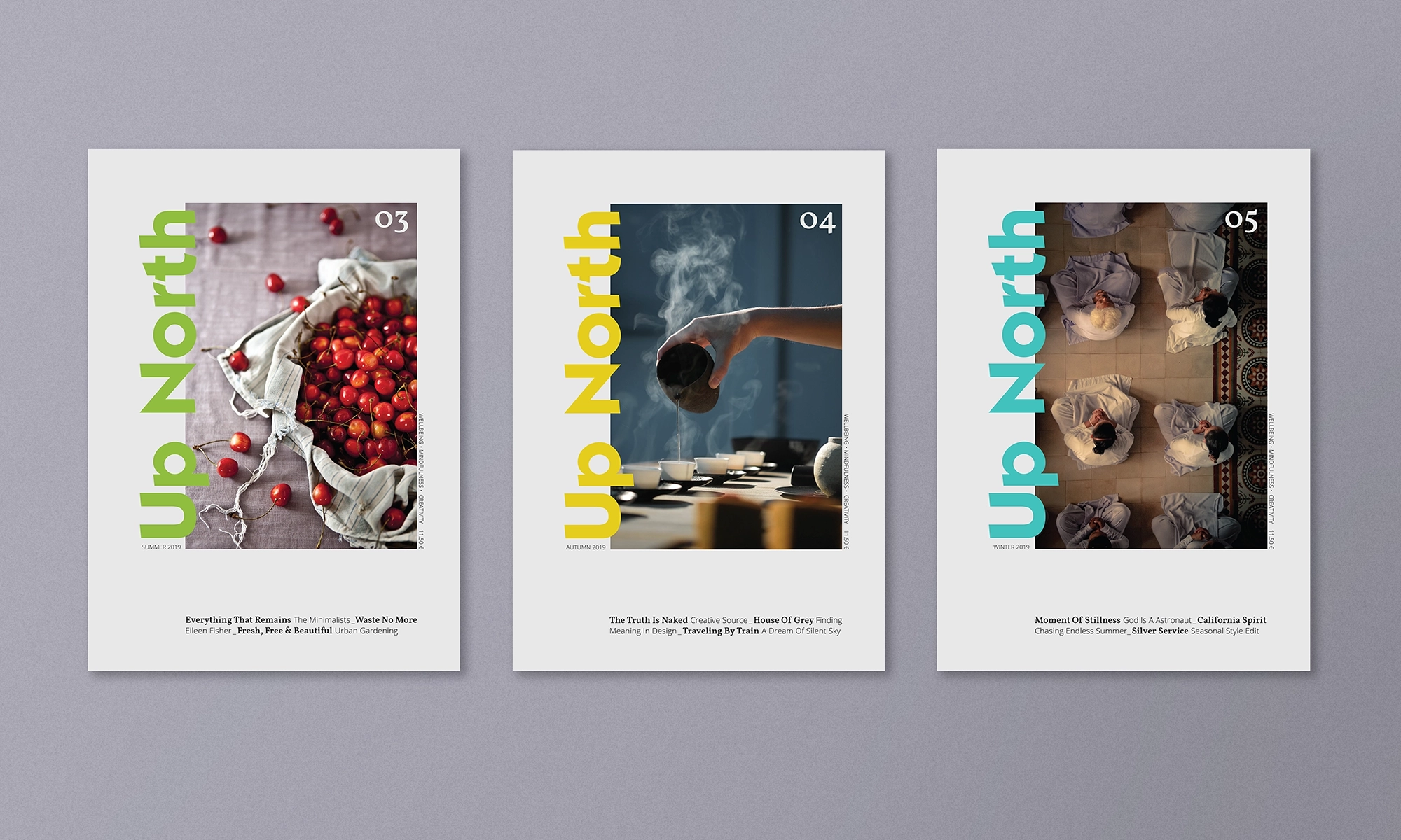
Up North is a quarterly lifestyle magazine that celebrates unhurried time, creativity, imperfection, and the simple pleasures of life. The name, inspired by the Danish concept of hygge – creating a warm atmosphere and enjoying life’s good moments with good people – reflects the magazine’s ethos.

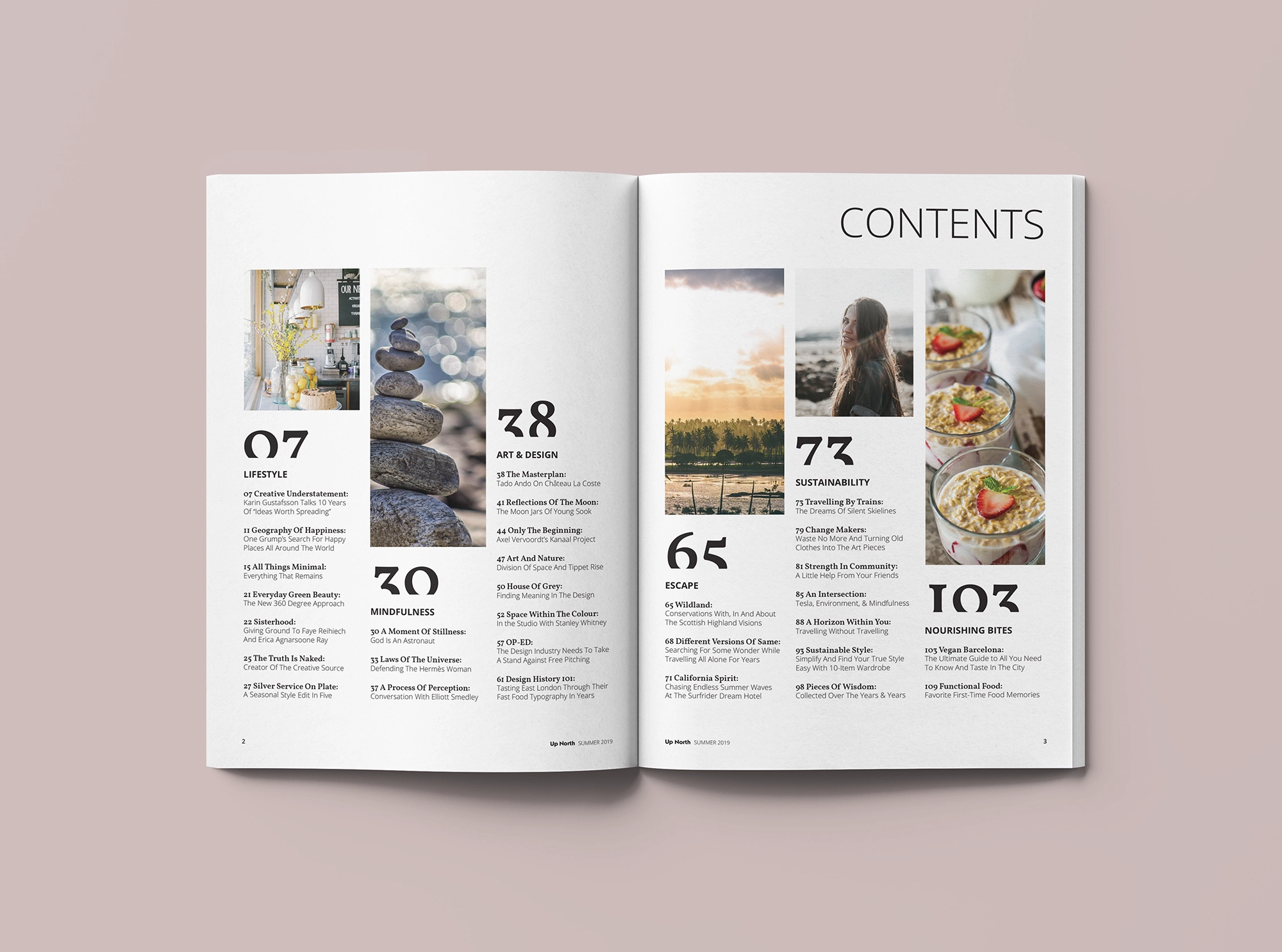
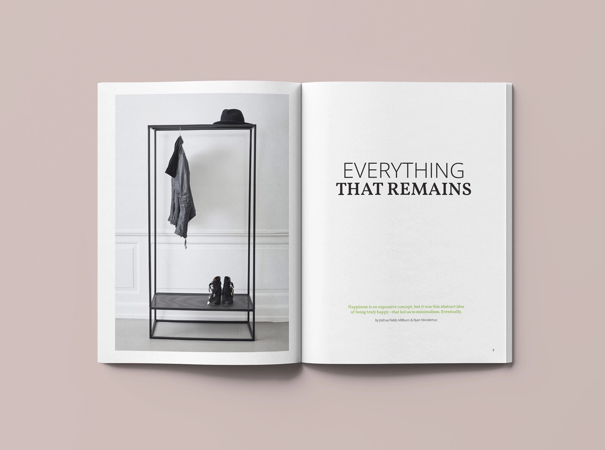
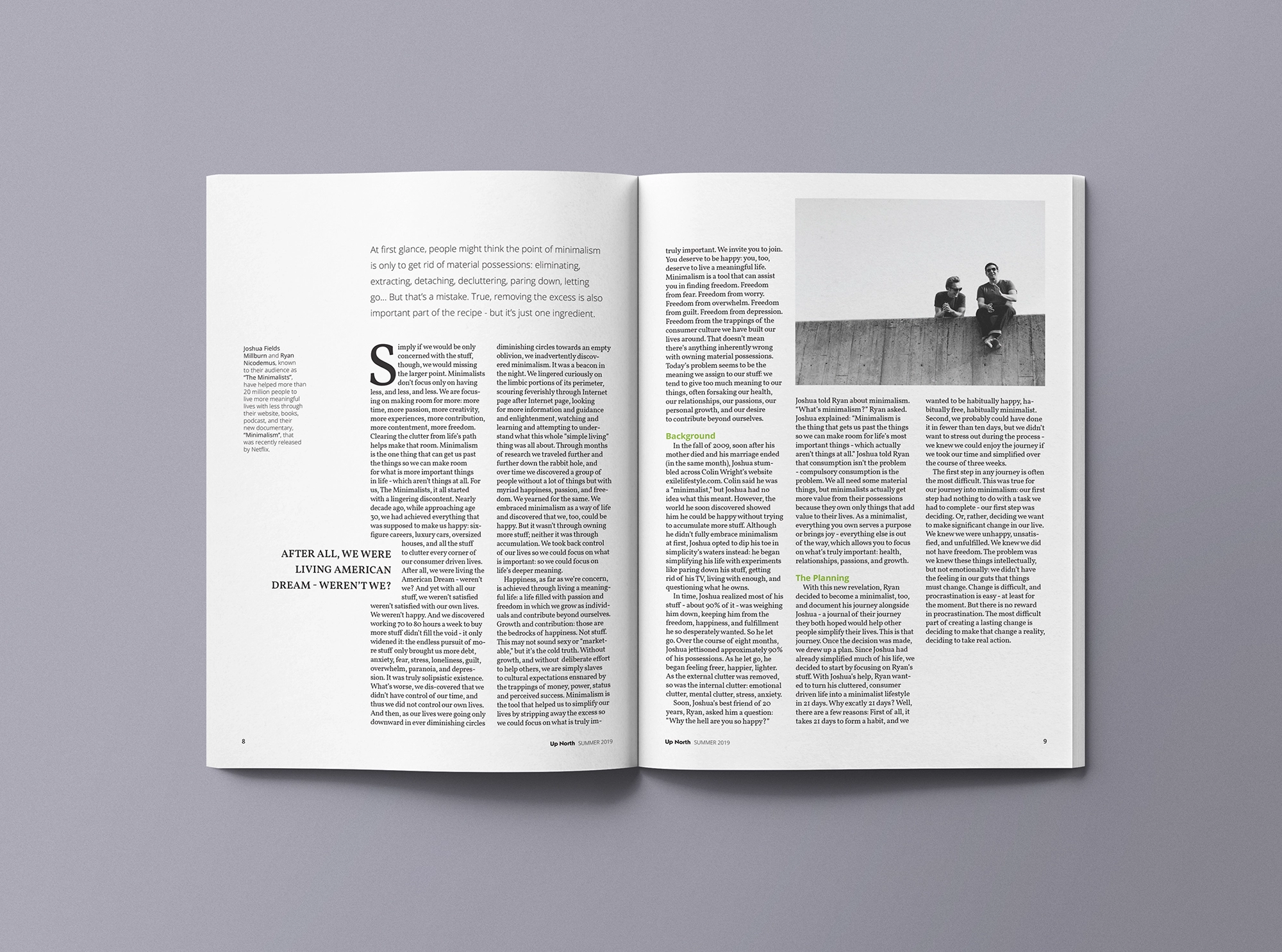
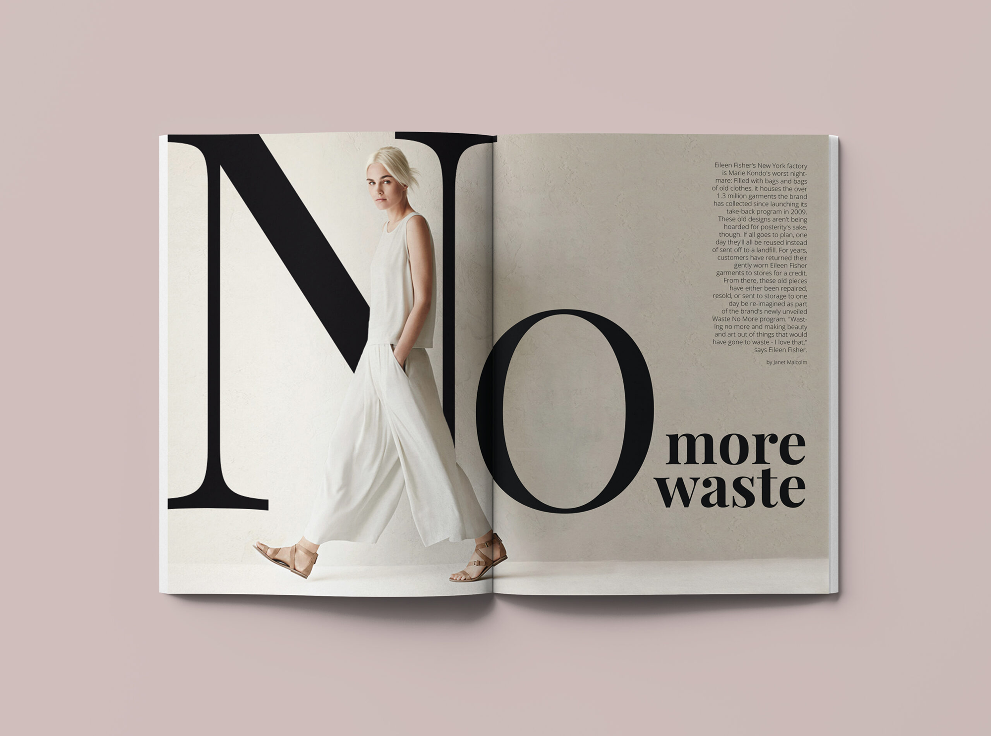
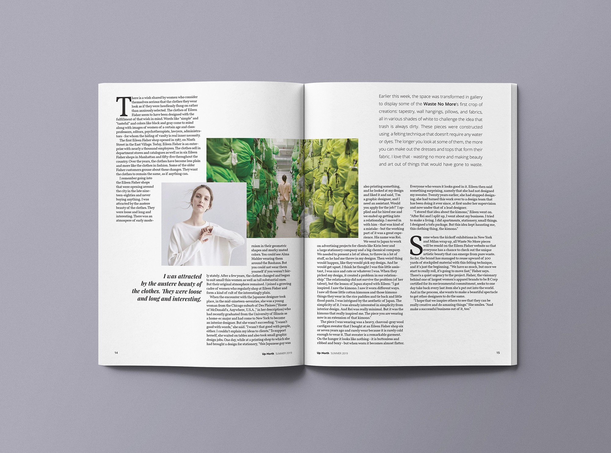
The project brief was to deliver a magazine design concept through a collection of three editorial design monographs. The scope included the development of one of them with a closed index in advance – cover page, index page, news page, and two long-form articles.

The Outcome

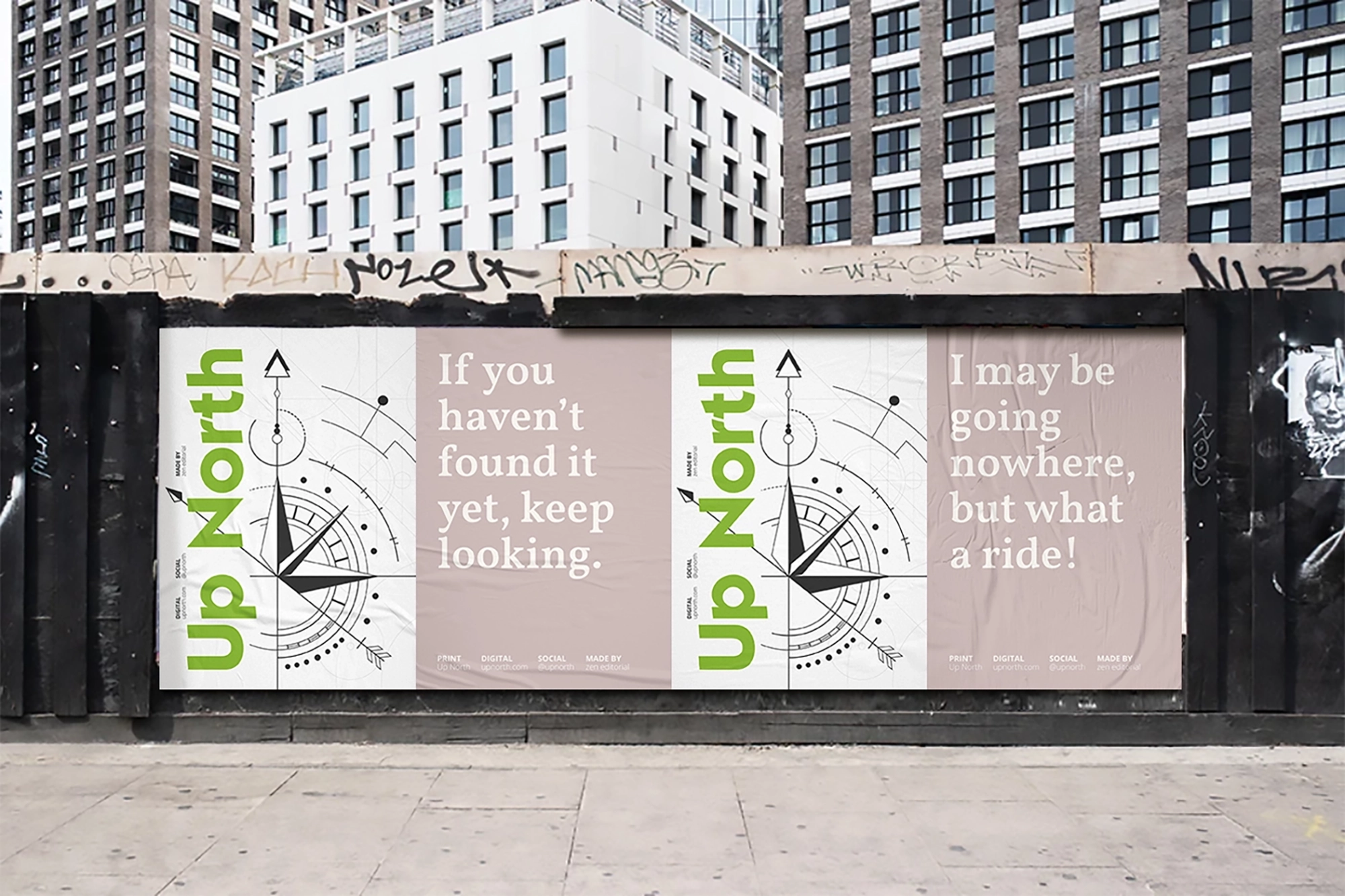
The goal was to craft a print design and editorial space where readers could unwind and connect with themselves. The visual identity, defined by playful minimalism, captured the essence of the magazine, while a compass illustration added symbolic depth, serving as a guide to finding happiness. Each issue invited readers to slow down and savor life’s little pleasures, enhancing the brand’s aesthetic and reinforcing its message of mindfulness.

Promotional posters for lifestyle magazine branding featuring compass illustrations and typographic brand messaging
Flat lay of lifestyle magazine covers featuring bold typography, editorial photography, and print design for mindfulness-driven publication
Coptic stitch as a visual identity design element - Three lifestyle magazine issues stacked to showcase coptic stitch binding with colored threads matching each cover color, reflecting handmade print design aesthetic
Close-up view of coptic stitch binding on lifestyle magazine, emphasizing handcrafted details and slow living editorial print concept

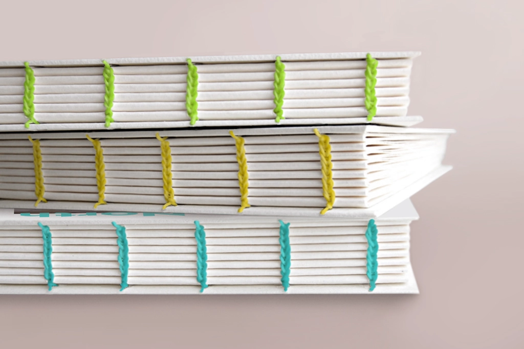
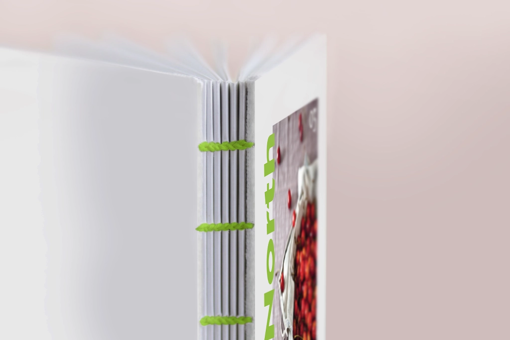
The coptic stitch binding was chosen to embody the essence of slow living, adding a touch of handmade charm. Each issue features a different thread color, matching the color of the cover title for a cohesive design.

Cover of featured lifestyle magazine issue overlaid on open spread, introducing editorial design and print layout concept developed for mindfulness publication
Double-page magazine content spread (index page) featuring bold page numbers, warm editorial photography, and clean layout grid for lifestyle print publication
Animated breakdown of editorial layout grid showing column structure, image placement, and text flow for lifestyle magazine design
Double-page magazine spread introducing long-form article with minimalist editorial photography and title design for lifestyle print publication
Zine - Editorial layout design for lifestyle magazine article on minimalism
Editorial layout design for lifestyle magazine
Magazine editorial spread with bold typography for sustainability article
Double-page magazine layout design with editorial photography and creative layout

Your Brand Glow-Up
Starts Here.

Nordic roots, Southern address.
Barcelona based, working worldwide.

home          work          about          services          journal          inquiry